Looking at those blue and red lines in our audio charts and graphs can be confusing. This article helps you understand their meaning and how to read them.
With this knowledge, you will understand what to expect from the headphones you buy, how they sound, and how well they block outside noise.

Understanding Decibels
Decibel expresses the ratio between two physical values: air pressure (voltage) & power in a smaller value on a logarithmic scale.
But since sound is basically compressed air, why don’t we use Pascals when talking about audio? The answer is convenience. Imagine saying that human hearing starts at 0.00002 Pa of pressure instead of simply saying 0dB.
Decibels represent values on a logarithmic scale, not linear. In audio terms, for each 10dB difference on a decibel scale, the loudness multiplies by 10.
Here’s a table of values for easier understanding:
- 0dB represents the value of 1
- 3dB is (roughly) 2 times louder than 0dB
- 6dB is (roughly) 4 times louder than 0dB
- 10dB is 10 times louder than 0dB
- 20dB is 100 times louder than 0dB (or 10 times louder than 10dB)
- 30dB is 1000 times louder than 0dB (or 10 times louder than 20dB)
- 40dB is 10,000 times louder than 0dB (or 10 times louder than 30dB)

Remember these values when looking at audio measurements and seeing “only” a 3dB difference because adding 3dB means doubling the loudness.
Another thing worth pointing out is how humans perceive different frequency regions. Based on the equal loudness curve, lower and higher frequencies need to be louder for humans to hear, whereas midrange frequencies naturally boost in our ears.
You should apply this knowledge when viewing the graphs by understanding that a 5dB difference in lows isn’t as audible as a 5dB difference in the mids.
How to Read Audio Frequency Response Charts?
Frequency response graphs show how headphones reproduce certain frequencies. The loudness of those frequencies is based on how high the line on the chart (y-axis) goes.
No headphones reproduce all frequencies equally (that would mean a perfectly neutral response). So, some regions are always slightly boosted or recessed, depending on how the manufacturer tunes them.
When performing frequency response measurements, we expose the differences, revealing the headphones’ sound signature and potential issues (peaky boosts can sound harsh, low bass sounds dull, etc.).
It’s good to know how to spot those areas to understand headphone measurements. Here’s an example to make it easier to grasp:
Remember that drawing a horizontal line (x-axis) through 300 Hz (a point where 300 Hz meets our measurement) would represent a perfectly neutral response.

Above, you can see a frequency response of SoundPEATS Air4. Straight away, you can see these earbuds have a W-shaped sound.
Low frequencies are boosted from 30 Hz to 200 Hz. 65 Hz frequency is increased the most, by around +6dB above the neutral line (see the chart below).

- Based on this data, you can expect slightly punchier bass (at 65 Hz) and added warmth due to a boost lasting up to 200 Hz.
If you like a nice punch in your songs, this is how the chart should look from the headphones you’re buying.
The midrange is boosted from 900 Hz to 1.9 kHz. 1.5 kHz frequency is increased the most, by around +7dB above the neutral line (see the chart below).

- This midrange boost results in slightly shouty (loudly and forcefully, almost harsh) and thin vocals (the voice doesn’t have a lot of fullness or richness, it can sound a bit weak or lacking in depth). Not perfect, but it’s not a deal breaker.
The shouty and thin vocals are loud and forceful but don’t have richness or depth.
Next, there’s also a recession in the midrange from 2 kHz to 5 kHz. The dip is the lowest at 2.5kHz by -7 dB.

- This recession amplifies the thinness of vocals and cuts away a little bit of energy from electric guitars, especially the 4 kHz dip.
Treble frequencies start with a slight boost of 3dB at 6 kHz (see screenshot below).

- Peaks between 6 kHz and 9 kHz typically add shimmer and energy to cymbals and a sensation of clarity (but not actual clarity).
- The recession around 8 kHz and 9 kHz is good, as boosting this region results in harshness.
The last peak in the treble is between 13 kHz and 15 kHz, with the highest increase at 14 kHz by +7dB.

- Boosts in upper treble above 10kHz are fine, as they add clarity and airiness to the sound.
- However, since the only increased frequency is 14kHz, you can expect clarity and texture in some cymbal types (other types might appear quieter and harder to hear, which affects the listening experience).
A quick recap on how to read frequency response graphs
The most important thing when looking at a frequency response chart is not to look at a perfectly flat line since that would sound lifeless and dull. Instead, watch out for these features:
- Slight bass boost that doesn’t go above 200 Hz: Slightly boosted bass adds warmth and body to the sound, making it more natural and impactful.
- Flat midrange: Since human ears are the most sensitive to midrange frequencies, it is best to keep them flat. That way, every voice and instrument gets represented naturally.
- Dip around 8-9 kHz: A recession in this frequency range prevents the sound from becoming too harsh while revealing true clarity. In contrast, boosting this range adds artificial clarity, like making cymbals louder, but without any texture or detail gain.
- Treble boost above 10 kHz up to 16 kHz: It adds some resolution and air into sound, making it less congested and easy to listen to.
How to Read Noise Cancelling (ANC) Graphs?
Our noise-cancelling graphs are simple to understand. You have to compare the gap between the “room response” and the ANC measurement to determine how much noise ANC removes at different frequency ranges. The wider the gap, the better.

What is the room response?
The thicker blue line in our graphs represents the room response. It is measured by playing a sine sweep audio signal via room speakers from 20Hz to 20kHz and capturing the response with artificial ears (without headphones).
We do this to simulate how a user hears the environment without wearing headphones. That way, we can accurately determine how much noise gets canceled by headphones.
“Room response” is raw, unblocked ambient noise.
After getting the room measurement, we place the headphones on our measuring rig and repeat the sine sweep with ANC activated.
- The new measurement shows how much ambient noise is cancelled before entering your ears.
To give an example, let’s look at TOZO NC7 active noise cancelling graph:
Comparing the blue line (room response) and red line measurement (TOZO NC7 with active noise cancellation enabled) shows that the ANC becomes effective above 24Hz.
The ambient noise reduction between 20Hz and 100Hz is -10dB on average.

- That is enough to make a difference when reducing engine or cabin noise hum but not enough to block it entirely. You still hear some rumble passing through.
Noise attenuation gets better between 150Hz and 500Hz, canceling around -14dB.

- This further helps reduce rumble and the lower end of human speech.
The graph shows that these earbuds are practically inefficient at 900Hz, so some parts of human speech might still come through as if you aren’t using ANC at all.
There’s one thing to keep in mind…
While the entire measurement shows how much less noise you hear, only the 20Hz to around 2kHz spectrum is the ANC reduction. After that point, the reduction is due to passive noise isolation only, as you can see in all the measurements we’ve done in the last year.

In all ANC headphones we’ve tested, the ANC stops reducing noise after 2kHz. Meaning that all ANC headphones combine active and passive reduction. This means you need a good seal for active noise cancellation to work as intended.
How to Read Passive Noise Isolation Charts?
Reading passive noise isolation charts uses the same logic as noise-cancelling graphs. There’s only one difference. Instead of measuring ANC and passive isolation performance, it only measures passive noise isolation without ANC.

To recap:
- The room response (a thicker blue line) represents ambient noise without wearing headphones.
- The passive isolation measurement (a thinner red line) represents how quieter the ambient noise gets when wearing headphones. The greater the difference between the two lines, the more effective the isolation.
Also, passive noise isolation typically becomes effective after 200Hz because lower frequencies are harder to block than higher ones.
That’s because higher frequencies have a shorter wavelength and less energy, so any obstacle can absorb them. In contrast, lower frequencies have a longer wavelength and more energy, passing through the ear cups/buds.
That’s why you hear the bass beat when listening to a distant concert or waiting in front of a club. And you don’t hear the treble. It gets absorbed by trees, hills, and building walls.
Let’s look again at the TOZO NC7 passive isolation measurement.
You can see passive noise isolation becoming effective from around 150Hz to 900Hz, with around -3dB in reduction.

- While that means the noise is reduced by half, the difference is negligible in real-world situations (due to the equal loudness curve).
After 1kHz, you can finally see a substantial reduction of ambient noise that goes up to 20kHz, with the highest reduction at 4kHz by -17dB (see below).

- Based on the graph, these earbuds effectively reduce speech and high-pitch noises (but not entirely). You will still hear everything around you, just a bit muffled.
For example, looking at the measurement from TRUTHEAR x Crinacle Zero:Red in-ear monitors, you can see they’re much more effective at passively reducing higher frequencies, even by -31dB at 10kHz.
Combining the ANC and passive isolation measurements from the same headphones shows where ANC performance diminishes, and passive isolation picks up.
How to Read Ambient Mode Comparison Chart
Ambient mode graphs follow the opposite logic.
If a bigger gap meant better performance in ANC and passive isolation graphs, you want to see the room response and the measurement as closely as possible in the Ambient mode graph.
The job of ambient sound mode is to boost the ambient noise to natural loudness so it feels like you’re not wearing headphones.
However, many headphones do the ambient sound mode differently. Most of them focus on boosting lower midrange frequencies, which are essential for understanding speech.
Ideally, you want to see a boost from 100Hz to 2kHz. The wider boost of frequency range, the better.
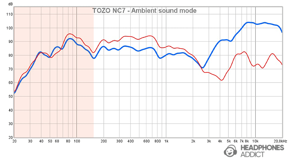
Since we made all examples on TOZO NC7, let’s look at their ambient sound mode performance:
Earbuds increase surrounding noise from 20Hz to 160Hz, with a slight boost of 2dB.

- Boosting lower frequencies too much can result in hearing overly warm voices. Fortunately, you need more than a 2dB increase to make the voices bloated.
On the flip side, ambient mode increases the frequencies between 180Hz and 1.5kHz, even by +5dB in some areas.

- Our ears are the most sensitive to midrange frequencies, so even tiny boosts or recessions can become audible. In the case above, you can expect voices to be slightly louder than usual and thin-sounding.
FAQ: Frequently Asked Questions About Audio Charts & Graphs
What is a frequency response graph?
The frequency response graph measures how an audio playback device (headphones) reproduces frequencies between 20Hz and 20.000Hz. The graph reveals a sound signature and potential issues in the sound.
What is a good frequency response curve?
A good frequency response curve is as close to neutral as possible since it ensures that every part of the song sounds as it should. However, the neutral curve can be boring, so the Harman target curve is ideal for a more enjoyable listening experience.
How do you measure frequency response?
You can measure frequency response by using dedicated measuring rigs (typically a kind of artificial ears). You can also use a microphone to make measurements, but they would be highly inaccurate.
What does noise cancelling response graph tell?
The noise cancelling response graph tells how much ambient noise gets cancelled by headphones when using ANC. The graph also shows which frequencies the ANC reduces the most.
Conclusion
Hopefully, charts make more sense to you. If not, let us know what isn’t clear, and we’ll do our best to explain it.
The important things to remember:
- Frequency response graphs show how headphones play each frequency, which tells you how they sound and whether they’re harsh, muddy, dark, have thin vocals, etc.
- Noise cancelling graphs show how well the feature reduces ambient noise at each frequency. Note that the greater the distance between the room response and ANC measurement, the better. The same logic applies to passive noise isolation graphs.
- Ambient mode graphs show how good headphones boost ambient noise and play it in your ears. In this case, the measurement must be as close to the room response as possible.
Check our extensive article on sound signatures to learn more about sound coloration. Furthermore, to better understand how headphones cancel noise, check how active noise cancellation works.

From a childhood fascination with sound, Peter’s passion has evolved into a relentless pursuit of the finest headphones. He’s an audio expert with over 5 years of experience in testing both audiophile and consumer-grade headphones. Quote: “After many years, I can confidently tell which headphones are good and which are terrible.” Find his honest opinion in his reviews.


